

Jewelry Display Defined: Purpose and Strategic Impact on Retail Performance
When we talk about jewelry displays, we're really looking at how stores showcase their pieces using special stands, cases, and other visual tricks that grab attention, keep items safe, and ultimately sell more products. The main job here is twofold actually getting people to see what's available while making sure nothing gets stolen or damaged. Good displays do much more than just hold jewelry though. They create stories around the products, setting the right mood when someone walks into a store. These setups help build brand recognition too, since consistent styling across different locations makes customers feel they know what to expect. And best of all, smart display arrangements lead shoppers naturally from one piece to another, almost like walking through an art gallery but with the chance to buy something beautiful along the way.
According to the latest Retail Psychology Report from 2024, when stores put thought into how they display jewelry, customers tend to see those pieces as worth about 30% more. That matters because people are more likely to buy what they think has higher value. These displays act kind of like silent sales staff. They keep things organized so inventory doesn't get messed up, help prevent shoplifting by keeping stuff in locked cases, and make sure special pieces stand out where shoppers actually look. Stores that match their display plans with how customers move around and what catches their eye typically sell 22% more of the highlighted items. The bottom line is simple: good jewelry displays transform empty cases into money makers. They save valuable floor space, reinforce the idea that these are premium products, and turn window shoppers into actual buyers without saying a word.
Common Jewelry Display Types by Form, Function, and Customer Journey Stage
Countertop, wall-mounted, and rotating jewelry displays for high-visibility zones
Displays on countertops close to checkout spots really grab those last minute shoppers because they're right at eye level and easy to reach. When stores mount products on walls, they get more space vertically and create great backgrounds for showcasing their best sellers. The rotating displays we see at store entrances let customers look around completely, which makes people spend about 27 percent more time interacting with products than regular setups according to Visual Merchandising Journal from last year. Retailers focus these busy display areas on items that sell quickly such as simple stud earrings and trendy rings, placing them exactly where customers tend to stop and browse as they walk through the store.
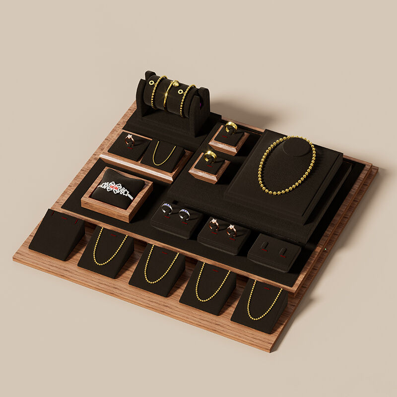
Busts, risers, trays, and pillows for category-specific presentation and tactile engagement
When customers see necklace displays, they get a better sense of how the jewelry will actually look on them. Velvet lined trays stop rings from rolling around while staff handles them, which makes everything look neater. Acrylic stands let stores arrange pieces in layers so the stones really stand out when lights hit them just right. And those soft fabric cushions? They make it super easy for shoppers to try on bracelets without feeling awkward about touching merchandise. Stores that use these hands on approaches tend to see about a 19 percent boost in sales for items people are still thinking about buying according to a recent study from Retail Experience in 2023. Every display method serves different purposes in getting products noticed and considered by potential buyers.
| Display Type | Primary Function | Customer Journey Impact |
|---|---|---|
| Busts | Showcase necklace drape | Visualization stage |
| Risers | Create elevation contrast | Attention capture |
| Trays | Organize small items | Comparison phase |
| Pillows | Enable product interaction | Decision confidence |
Core Jewelry Display Principles: Visual Hierarchy, Space, and Attention Guidance
Effective jewelry displays don’t just hold products—they shape perception. Grounded in visual merchandising science, these principles boost engagement by 20% and strengthen perceived value (Visual Merchandising Impact Report, 2024).
Triangular grouping and parallel alignment to reinforce brand consistency and product focus
When arranging displays, triangular setups tend to naturally guide attention towards key items. This works because people have this innate tendency to fill in gaps they see, completing shapes mentally to make everything look whole. For parallel arrangements, placing similar items together around regular viewing height helps create a rhythm across the space while keeping the brand's identity consistent throughout. These display methods actually cut down mental effort needed to process what's on view compared to messy arrangements. Collections presented this way just feel more thoughtfully put together, as if someone really cared about how each piece relates to the others and matches the overall brand personality.
Intentional use of negative space to elevate perceived value and reduce visual fatigue
Emptiness is not wasted space—it’s strategic emphasis. Research shows dedicating 40–60% of display area to negative space increases perceived value by up to 35% (Retail Psychology Today, 2023). This breathing room:
- Isolates high-margin pieces with premium intent
- Prevents sensory overload during extended browsing
- Highlights craftsmanship through light and shadow
- Directs attention like a visual runway
Minimalist displays reduce decision fatigue by 22% and make pieces appear 50% more luxurious—not through abundance, but through restraint.
Integrating Jewelry Displays into the Broader Retail Environment
Permanent vs. modular jewelry display systems: balancing branding, flexibility, and cost
Stores that want to build strong brand identities often go for custom made displays built from top quality materials. These installations definitely scream heritage and exclusivity, but come at a steep price tag upfront and don't really allow much room for change later on. On the flip side, modular display systems let retailers rearrange components whenever seasons change or new promotions roll in. According to a recent industry report from last year, these flexible setups can actually save stores between 30 and 50 percent over time on their display costs. The catch? Cheaper materials tend to make customers question the luxury aspect unless everything is finished just right. Most upscale boutiques stick with those permanent fixtures because they feel more authentic somehow. Meanwhile, stores carrying multiple brands generally prefer the flexibility that modular options provide. We're starting to see something interesting happening though - a middle ground approach where basic structures stay standardized but surfaces get upgraded with premium finishes. This gives businesses the best of both worlds without breaking the bank while still maintaining that elevated brand image.
Window, checkout, and fitting-area placements to align jewelry display with purchase intent
Putting things in the right spots helps turn what people see into actual sales. Store windows work like giant advertisements for brands these days. When stores tell stories through their window displays, they tend to get about 25% more people walking past who actually go inside. The checkout area is another goldmine for retailers because shoppers hang around there longer. They stock cheaper stuff under $200 here, and roughly 1 in 5 accessories sold comes from those last minute grabs. Inside fitting rooms, stores often put together matching items like pendants with V-neck shirts. About 4 out of 10 customers end up buying something extra when they see these combinations. Retailers are smart about placing displays where people naturally pause between steps in their shopping journey near dressing rooms, after making purchases, or at entry points throughout the store. These strategic locations catch customers when they're most likely to make decisions, keeping the shopping experience flowing smoothly while making products seem more relevant.